In the first warm up I didn't know what I was doing. I had produced some satisfying drawings the week before but it was as if I couldn't remember how I did it.On the first one I ended up drawing back into the colours with black chalk. Some people liked it but I didn't. I decided to do the next one without colour, a combination of black chalk and charcoal. It's different to
Brockweir where we are further back, here we very close which leads to inevitable cropping. The third drawing felt more like last week as I became looser and started to attack it more.

The afternoon session was much better. Penny got into some great poses and I carried on where I had left off applying the chalks more freely. I was using the lighter brighter colours and using both the point and the flat side of the chalk. I also tend to use my little finger to knock back some of the marks. By the end I was loving it.
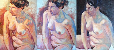
 The first image in this sequence shows the painting as it was at the end of last week, the second one after an hour and the third at completion. The radical change in colour is due to different lighting conditions. I struggled at first knowing quite what I was doing. The idea last week was to try to approach the painting like I do my warm up drawings. Alex wanted me to apply the colours in strokes and not get too fussy and tight as I usually do. He wanted me to be bolder with the colour like I am with my pastels, ' a leap of faith' as he called it. In explaining what he meant he likened the approach to the method of the Post impressionist painter Seurat whereby colours mix optically and the painting works when viewed from a distance. It was difficult to stand back and assess things as I was hemmed in where I was positioned. When I did manage to take a look at it from a distance it looked awful . I reverted to painting in the style I had been using recently and found it helped if I stood further back holding the brush at arms length. I added a dark background by mixing alizarin, cadmium yellow and ultramarine on the canvas and it helped.I had added vermilion and cobalt blue to my palette but as the afternoon session progressed I felt the colours were becoming muddy. The face was wrong and needed redrawing which was difficult as Penny had moved. It was worth approaching the painting in the way I did as I think it is the way forward and I will try it again at Brockweir tomorrow


 A strange little painting. I never really got the drawing right' the head and body don't seem to go together. I think it was a mistake to not have the top of the head in as it seemed to make the measuring more difficult. I wanted the hand in and to have the top of the head as well would have pushed the figure too far back. I blocked the whole figure in with diluted paint using varying mixtures of cadmium yellow, vermilion and ultramarine , but no white. I wanted to go from dark to light. I don't think it was a good decision as the colours got crude and dirty and it would have been better to have added a bit of white or naples yellow to the mixtures When you make a bad move in the early stages you are always fighting it for the rest of the painting. I applied the paint using a variety of brushes because I couldn't settle on one that felt right. The flat bristle seemed better than the synthetic ones I have been favouring lately.
 Some areas of the painting I am pleased with. I like some of the 'slabs' of paint I have applied in certain areas and I think the cool blues on her face and back work well. The warmer side of her body is not as good and is too yellow.
 Overall I am quite pleased with the outcome and even though there are areas that could do with working on I am going to leave it as it is. Next week I will take advantage of her amazing face and do a portrait.


 Another disappointing end result after promising early stages. I tried using flat synthetic acrylic


 For the first one in the afternoon I started with charcoal and then used coloured chalks on black sugar paper again.
 Using vermilion thinned down with white spirit I loosely sketched in the pose on an old canvas that had been thinly covered in oil primer. The surface was a bit slippery and wasn't easy to work on. I started to apply some colour. I was trying to work the whole area but was struggling to mix the the colours I wanted and not enjoying the feel of the paint on the slippery surface. I don't know why it felt like it did but it could have been because I hadn't mixed in some oil colour with the primer like I usually do. Someone came up at this point ad said they liked it and that I should leave it like this, a confusing suggestion at 10.30 in the morning.
 I didn't leave it and continued to mix up and apply colours but now with a larger flatter brush than I usually use. At this stage I quite liked it but I knew I was struggling and didn't feel in control. The image on the screen looks better than in real life and suggests I know what I am doing.
 There was a need at this stage to redraw certain areas. When I look at the Face and and surrounding areas I like it but the paint was getting thicker and I decided to scrape back with a palette knife. This was something I had never done before and suddenly I was in real trouble. I struggled on for a while and then decided to leave it alone and instead do a monochrome study using just vermilion and white.
 This is a close up showing the effect of the scraping back I think it looks good but I had lost it by now and was not in control of what was happening.
 This took about an hour and was fun to do. The surface was much easier to work on and it was nice to forget about colour and just concentrate on tone. Although I was using only red and white the cool coloured ground showing through made it work. I wonder what it would be like to add colour to this when it is dry.

 The first image in this sequence shows the painting as it was at the end of last week, the second one after an hour and the third at completion. The radical change in colour is due to different lighting conditions. I struggled at first knowing quite what I was doing. The idea last week was to try to approach the painting like I do my warm up drawings. Alex wanted me to apply the colours in strokes and not get too fussy and tight as I usually do. He wanted me to be bolder with the colour like I am with my pastels, ' a leap of faith' as he called it. In explaining what he meant he

 Three 10 to 15 minute gestural drawings using black and white pastels
  Three more in the afternoon this time using coloured pastels to reinforce the ideas I had been working on with the painting. Alex's studio is much smaller than the hall at Brockweir and you have the model much closer.


